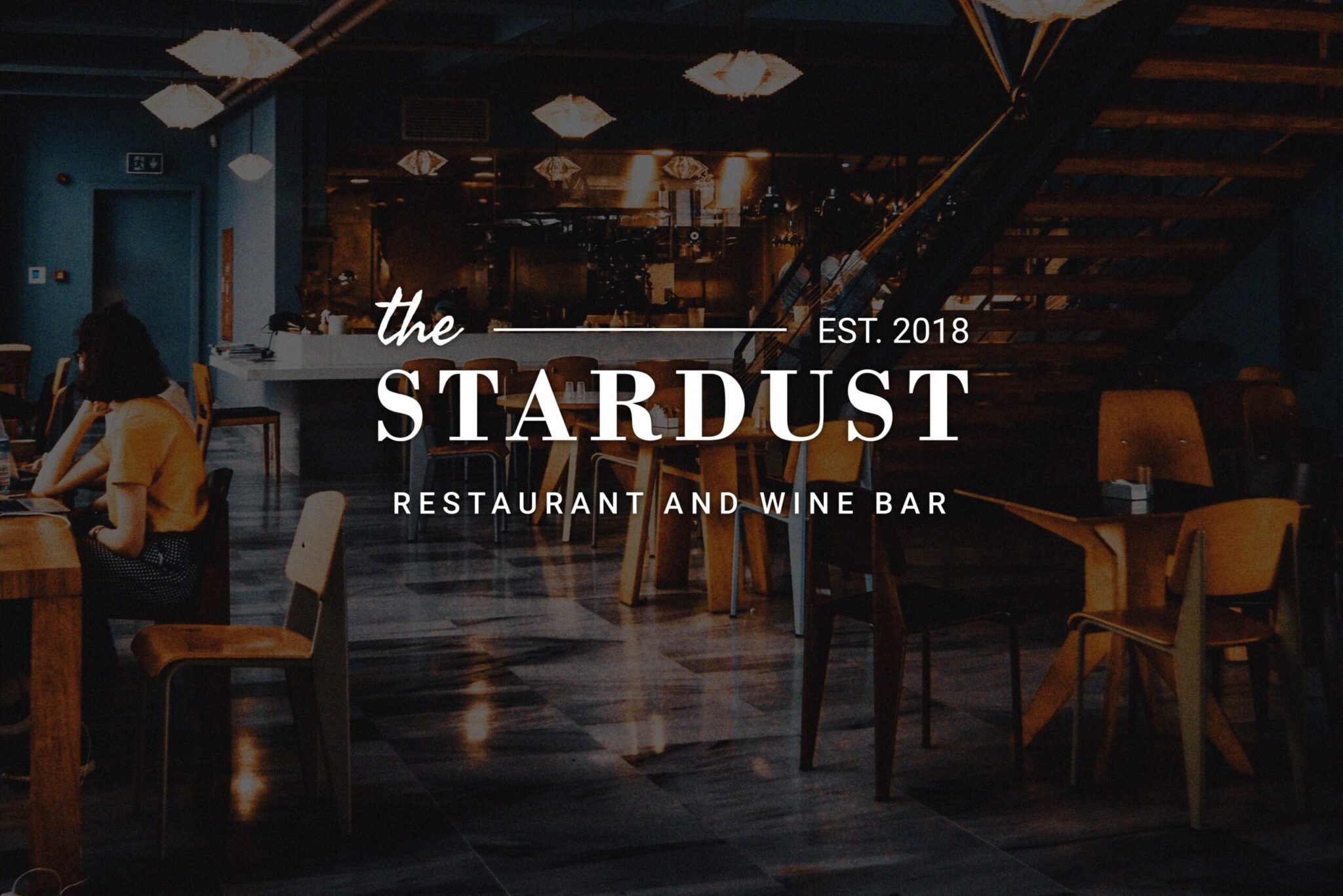
An Exceptional and Memorable Brand Identity and Packaging for a Restaurant Brand.
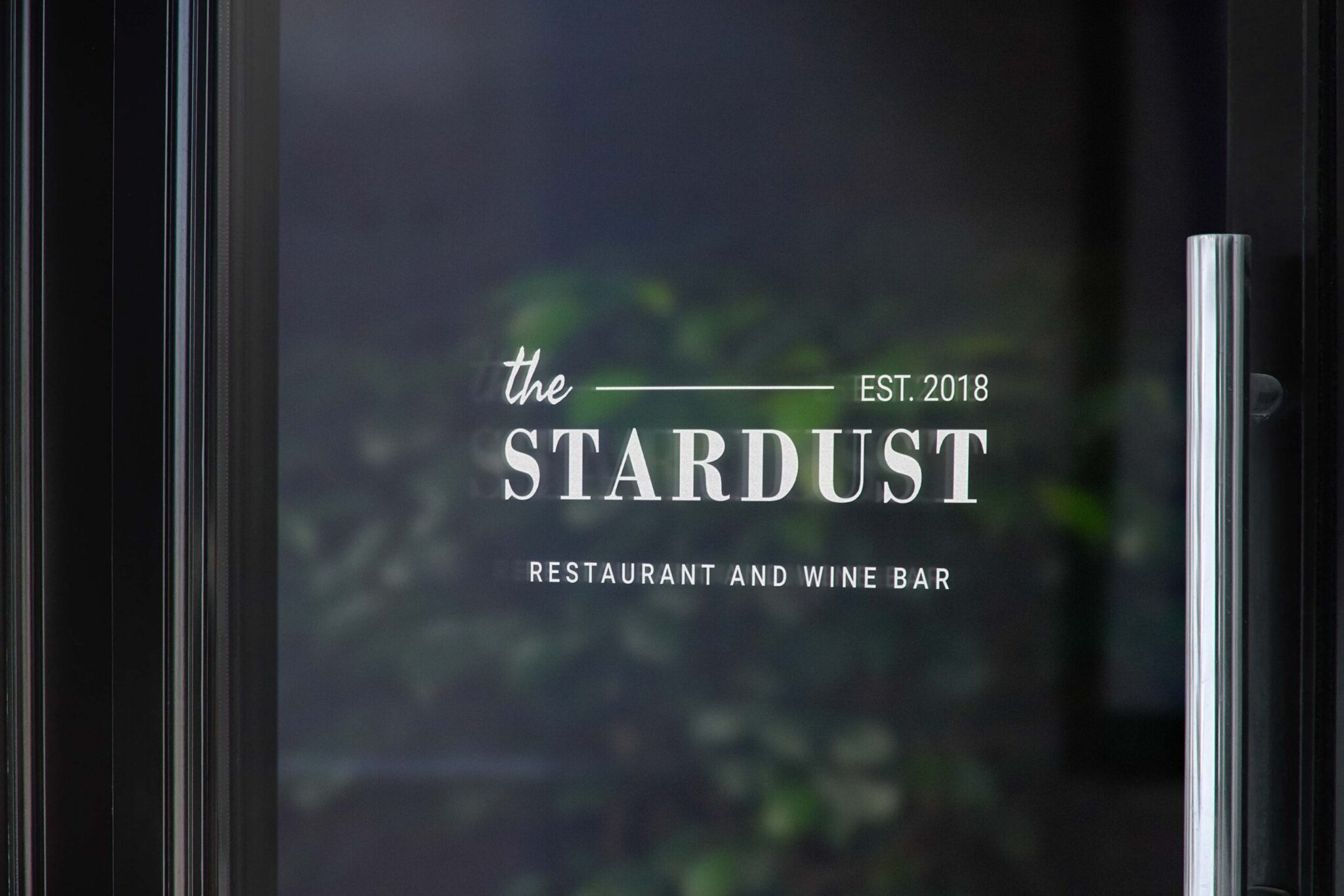
The Stardust is opening in a trendy area, featuring a farm-to-table concept, and is in need of a branding identity that reflects its unique approach to dining. As the branding designer, I was tasked with creating a new branding identity that would effectively communicate the restaurant’s focus on fresh, locally-sourced ingredients and its rustic yet elegant atmosphere.
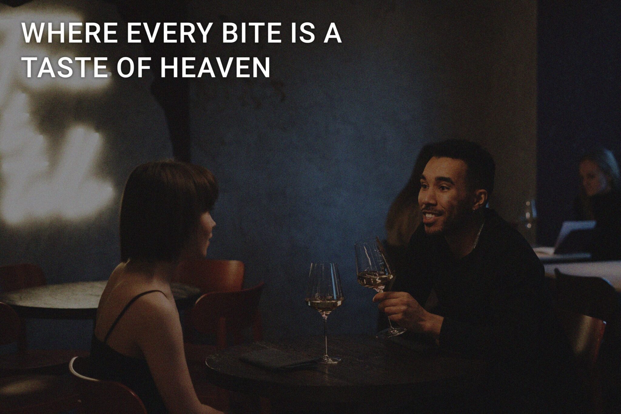
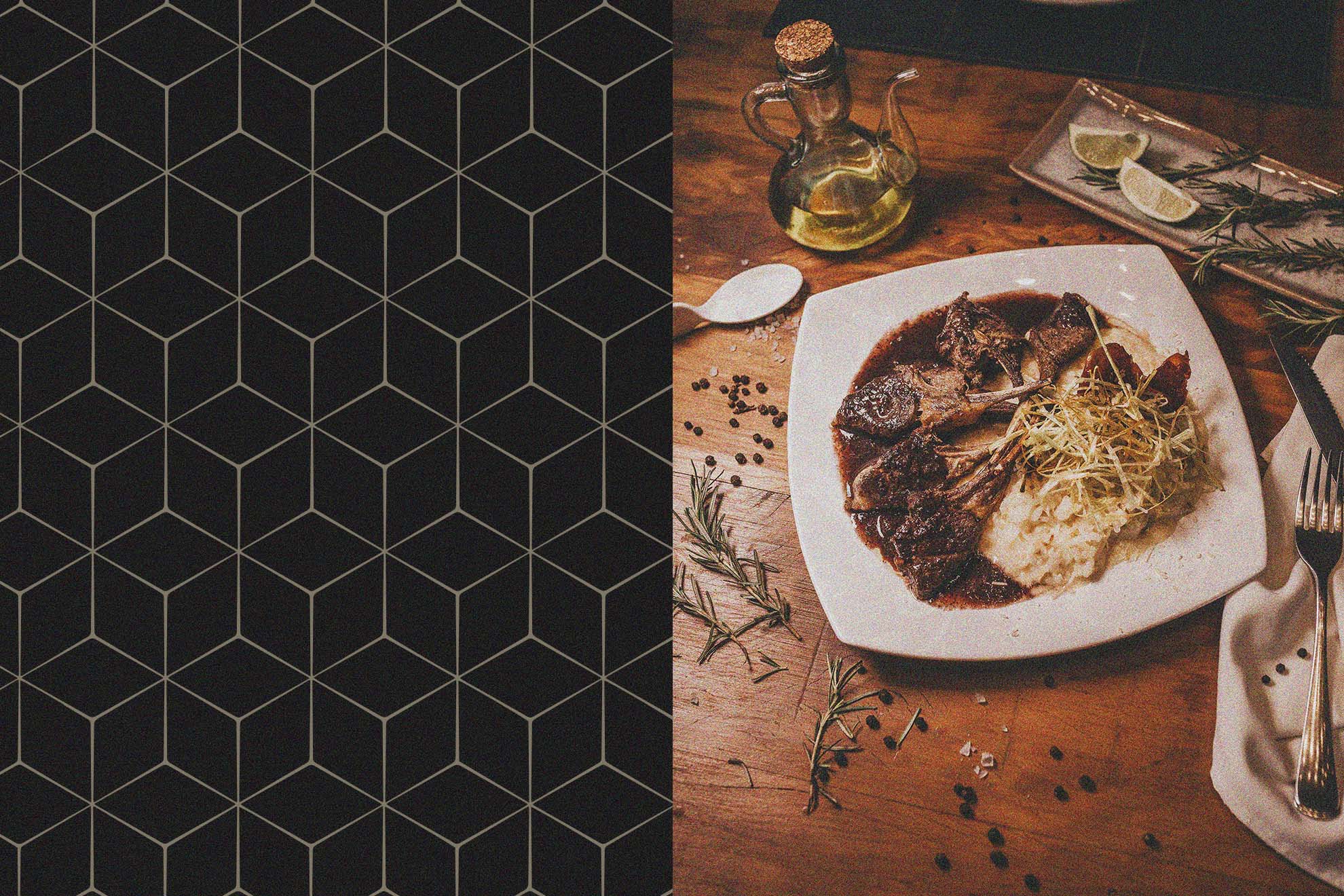
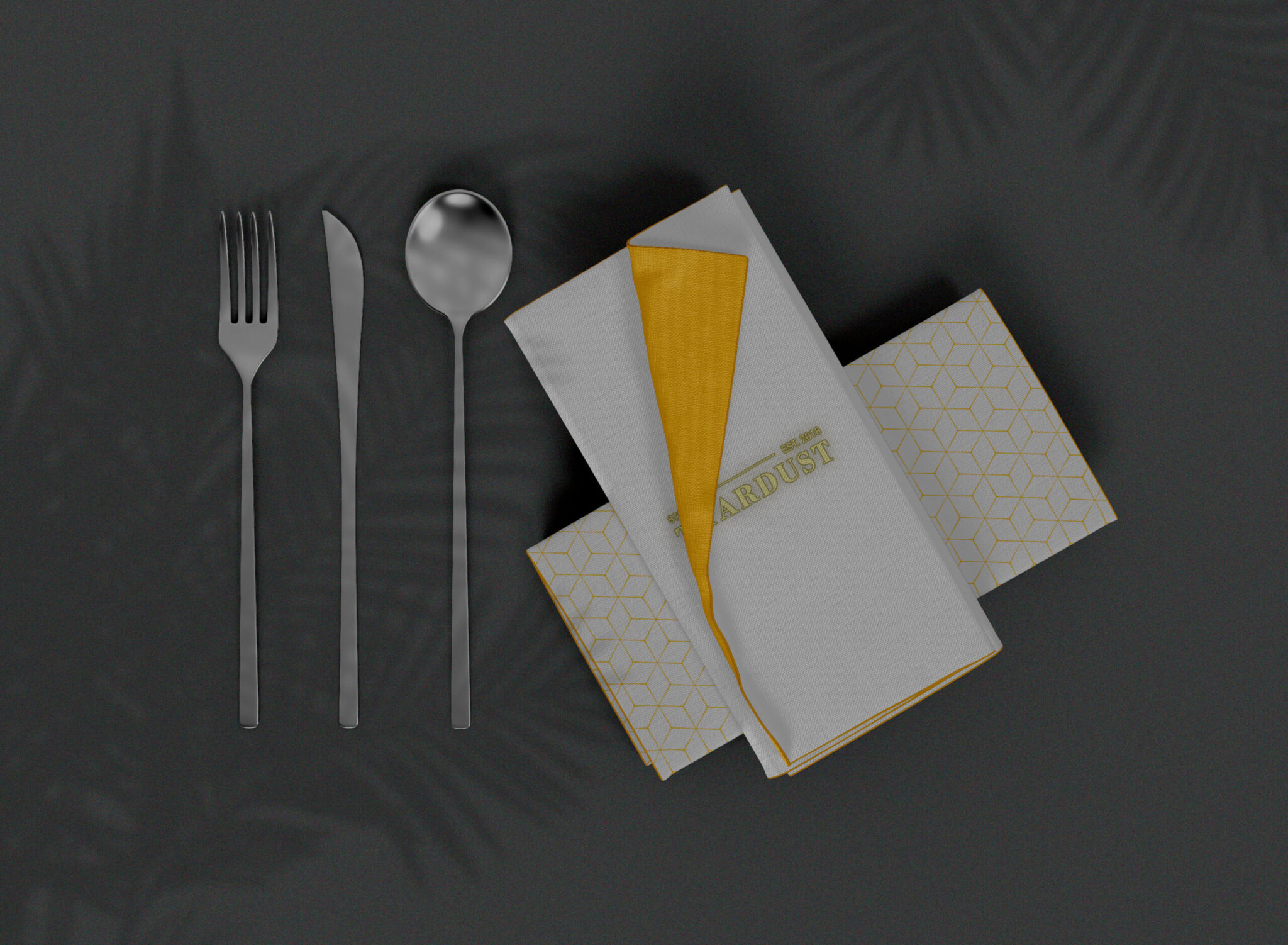
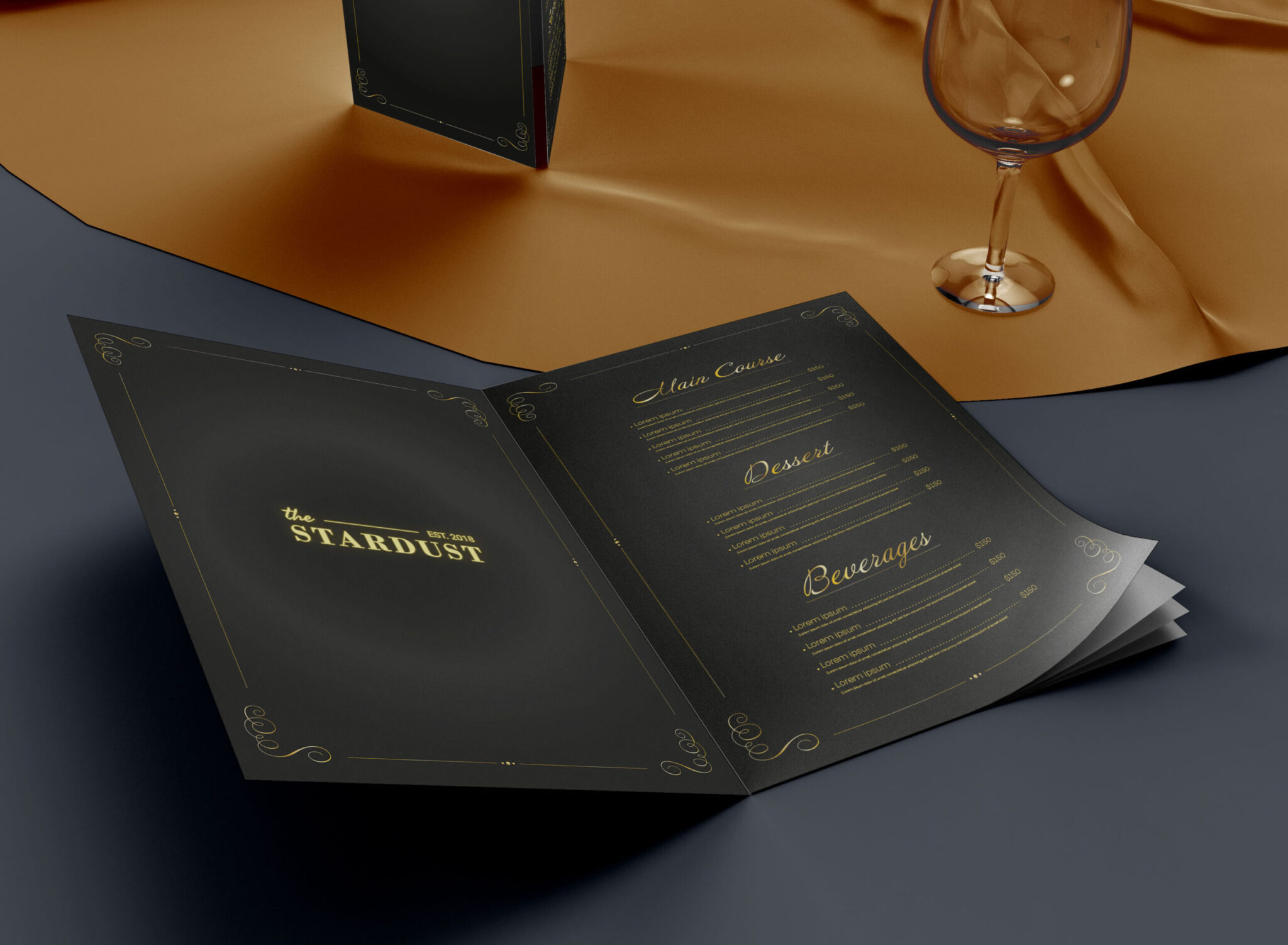
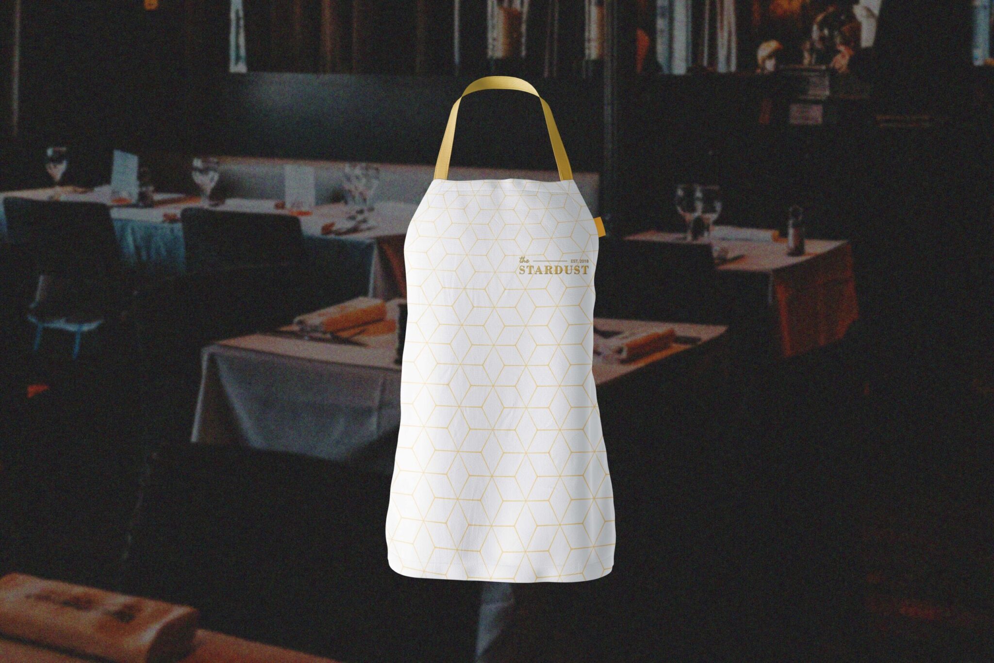
The final design includes a logo featuring an illustrated farm scene and a color palette of earthy greens and browns, reflecting the farm-to-table concept. The typography is a mix of modern and classic serif font that adds elegance to the rustic concept. The brand identity was then implemented across all materials, from the menu to the business cards, ensuring consistency and a strong brand image for The Stardust.